MENU
Black History Month
Black History Month
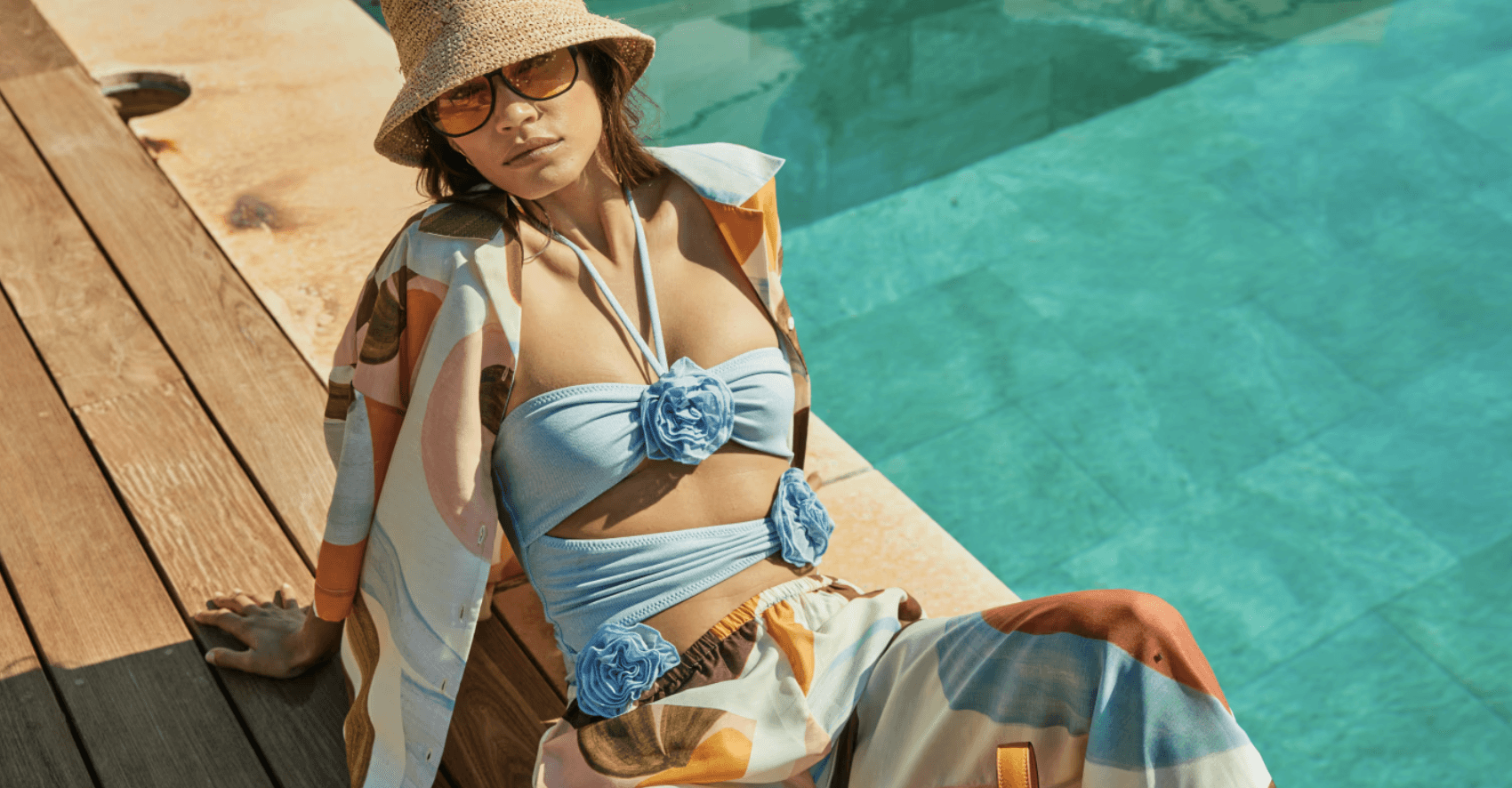
This Black History Month campaign shines a spotlight on the incredible contributions of Black designers and creatives, celebrating their talent through our social media content. This campaign honours creativity and culture while fostering appreciation for diverse voices in the industry.
I led the design direction, developing a distinctive visual language through thoughtful typography and colour palettes, and executed engaging animated videos that bring these narratives to life.
Studio
Studio
Threads Styling
Threads Styling
Year
Year
2022
2022
Role
Role
Creative Design Lead
Creative Design Lead
Focuses
Focuses
Art direction Content Creation Animations
Art direction Content Creation Animations
Art Direction
Art Direction
I led the art direction for the entire Black History Month social media campaign.
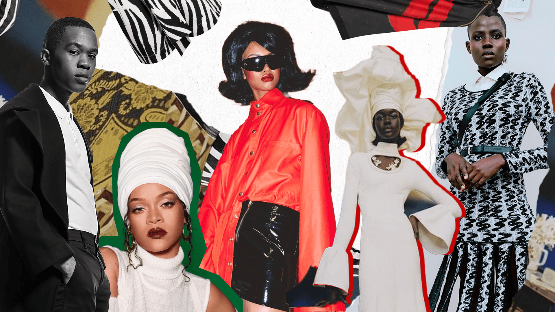
This particular sub-project focuses on the the video production. With the aim to celebrate and elevate the voices of Black designers and creatives, I created a visual narrative that embraced a collage and ripped aesthetic, symbolising the diverse backgrounds and cultures of the featured artists.
By exploring the use of black-and-white imagery contrasted with vibrant pops of colour, I aimed to evoke the essence of Black History Month, where the colours represent unity, pride, and resilience.
This approach not only highlights the individuality of each designer but also weaves their stories into a cohesive celebration of heritage and creativity.
I led the art direction for the entire Black History Month social media campaign.
This particular sub-project focuses on the the video production. With the aim to celebrate and elevate the voices of Black designers and creatives, I created a visual narrative that embraced a collage and ripped aesthetic, symbolising the diverse backgrounds and cultures of the featured artists.
By exploring the use of black-and-white imagery contrasted with vibrant pops of colour, I aimed to evoke the essence of Black History Month, where the colours represent unity, pride, and resilience.
This approach not only highlights the individuality of each designer but also weaves their stories into a cohesive celebration of heritage and creativity.
Art Direction
I led the art direction for the entire Black History Month social media campaign.
This particular sub-project focuses on the the video production. With the aim to celebrate and elevate the voices of Black designers and creatives, I created a visual narrative that embraced a collage and ripped aesthetic, symbolising the diverse backgrounds and cultures of the featured artists.
By exploring the use of black-and-white imagery contrasted with vibrant pops of colour, I aimed to evoke the essence of Black History Month, where the colours represent unity, pride, and resilience.
This approach not only highlights the individuality of each designer but also weaves their stories into a cohesive celebration of heritage and creativity.
Stylistic Direction - Colours & Typopgraphy
Stylistic Direction - Colours & Typopgraphy
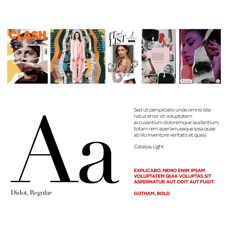
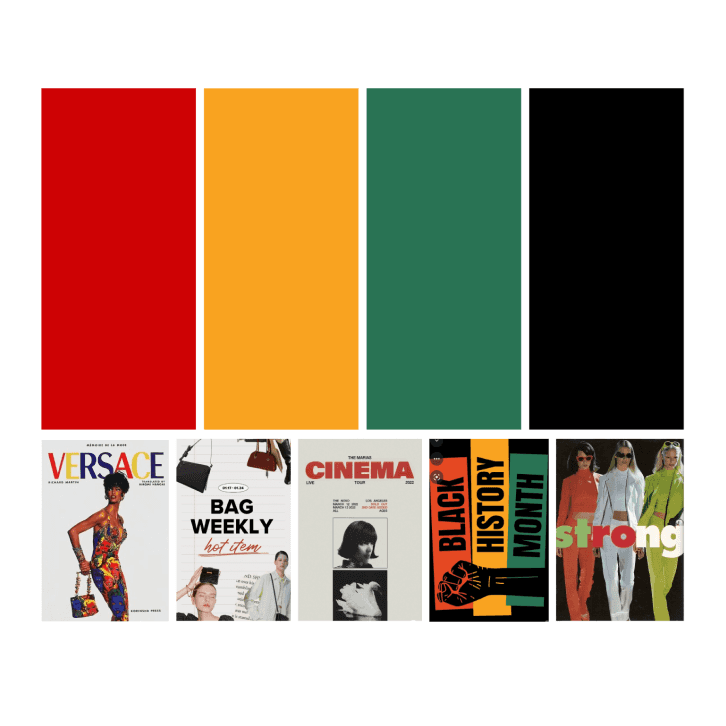
The colour palette not only adds visual interest but also symbolises unity and celebration of heritage. To further emphasise strength and resilience, I opted for bold typography that makes the words stand out, ensuring the messages of the campaign are both powerful and memorable. I chose a serif font to give the deliverables a magazine-like quality, which beautifully complements the ripped paper and collage style. The intentional use of colour and texture was vital to convey a rich, layered narrative, making each video a powerful tribute to the contributions of Black creatives in our industry.
The colour palette not only adds visual interest but also symbolises unity and celebration of heritage. To further emphasise strength and resilience, I opted for bold typography that makes the words stand out, ensuring the messages of the campaign are both powerful and memorable. I chose a serif font to give the deliverables a magazine-like quality, which beautifully complements the ripped paper and collage style. The intentional use of colour and texture was vital to convey a rich, layered narrative, making each video a powerful tribute to the contributions of Black creatives in our industry.
Stylistic Direction - Colours & Typopgraphy
The colour palette not only adds visual interest but also symbolises unity and celebration of heritage. To further emphasise strength and resilience, I opted for bold typography that makes the words stand out, ensuring the messages of the campaign are both powerful and memorable. I chose a serif font to give the deliverables a magazine-like quality, which beautifully complements the ripped paper and collage style. The intentional use of colour and texture was vital to convey a rich, layered narrative, making each video a powerful tribute to the contributions of Black creatives in our industry.
Deliverables - Paid Advertisements
Deliverables - Paid Advertisements
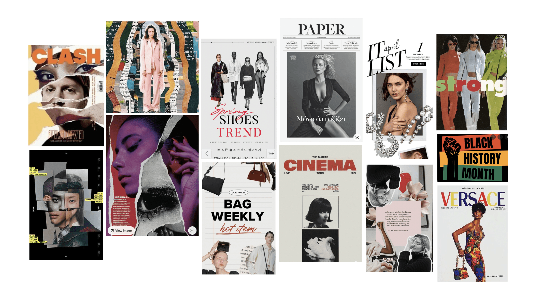
I incorporated stop-motion style motion design to bring the ripped collage assets to life, enhancing the overall aesthetic of the videos. This technique perfectly complements the magazine-inspired, ripped style, evoking the tactile experience of tearing images from magazines and arranging them in a collage book.
The stop-motion adds a dynamic quality, creating a rigid yet sketchy feel that emphasises the non-structured nature of the artistic process.
Deliverables - Paid Advertisements
I incorporated stop-motion style motion design to bring the ripped collage assets to life, enhancing the overall aesthetic of the videos. This technique perfectly complements the magazine-inspired, ripped style, evoking the tactile experience of tearing images from magazines and arranging them in a collage book.
The stop-motion adds a dynamic quality, creating a rigid yet sketchy feel that emphasises the non-structured nature of the artistic process.
NEXT UP
NEXT UP
NEXT UP
NEXT UP
©2026 MILLIE CARTER
Back To Top
©2026 MILLIE CARTER
Back To Top